Campaigns
Campaign:
Your Body Is Your Temple
The chosen SDG (Sustainable Development Goal) focuses on ensuring healthy lives and promoting well-being globally, targeting premature deaths, access to quality healthcare, and risk education (United Nations, 2023). The challenge centers on eating disorders, addressing their causes, especially body image, to challenge societal ideals and raise awareness. Negative body images pose mental and physical health challenges, aligning with the SDG goals. The target audience is university students dealing with eating disorders or negative food relationships during the crucial stage of entering adulthood and defining personal identity.
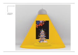
Titled “Your Body Is Your Temple,” the concept metaphorically emphasizes individual health’s importance, urging people to prioritize health over body image. Drawing inspiration from traditional Japanese ideas about the sanctity of the Shrine, it highlights the enduring value of one’s health. Emphasizing the unchanging value of one’s body over time, the concept promotes harmony between health and body, advocating for supportive surroundings that protect rather than harm. Drawing parallels with the Shrine’s innermost chamber, it underscores the significance of internal well-being, urging individuals to value and protect what’s inside.
 |  |  |  |
|---|---|---|---|
 |


Describe your image
Rebrand:
Shongweni Farmers & Craft Market
The Shongweni Farmer’s & Craft Market is the place to be. The market has its own unique ambiance. It is a place of vibrancy, filled with community, and leaves a mark on all those who visit it. The most important people, the people who make it all that it is, are the makers. Behind the market is a sense of nostalgia, linked to its distinctive location and memorable surroundings. The new visual identity created for The Shongweni Farmer’s & Craft Market represents each of these factors. It is full of vibrant colours, resembling patterns, and abstract illustrations. The handmade typography in the logo speaks to the idea of craftsmanship. The icon within the logo visualizes the idea of handmade and the nostalgia within the surrounding sugarcane. It similarly highlights the maker, those who make the market possible. The abstract style communicates the concept of authenticity. Finally, the visual identity speaks to the target market - each and every person within a community through its diversity and connection to the concept of community.

 |  |  |  |
|---|---|---|---|
 |  |  |  |
 |


Describe your image